
Murdoch Property
Logo Design • Style Guide • Stationery • Signage • Sold Flyers • Flags • Open Home Stands • Sales Brochure • Newspaper Advertising Templates
Murdoch Property is a Newcastle and Lake Macquarie real estate agency, led by Luke Murdoch, with nearly 20 years of experience helping local buyers and sellers.
The challenge
Murdoch Property already had a logo that had served them well for a number of years. They were ready to take their brand to the next level, while keeping some of the elements of the original logo that people already knew.
The new brand also needed to feel neighbourly: a friendly local agent who is easy to talk to, and still professional. And it had to work hard where a real estate brand is seen every day, on signs and flags at the front of a property, in newspaper ads, in letterbox drops and online.
The solution
We redesigned the logo, keeping some elements of the original and taking it to the next level with a more confident, polished look. A strong MURDOCH wordmark sits with PROPERTY in widely spaced capitals beneath, beside a rounded leaf shape that feels neighbourly and stands for growth. Deep navy and soft teal give it a calm, trustworthy feel, and a soft pink is saved for moments that matter, like SOLD.
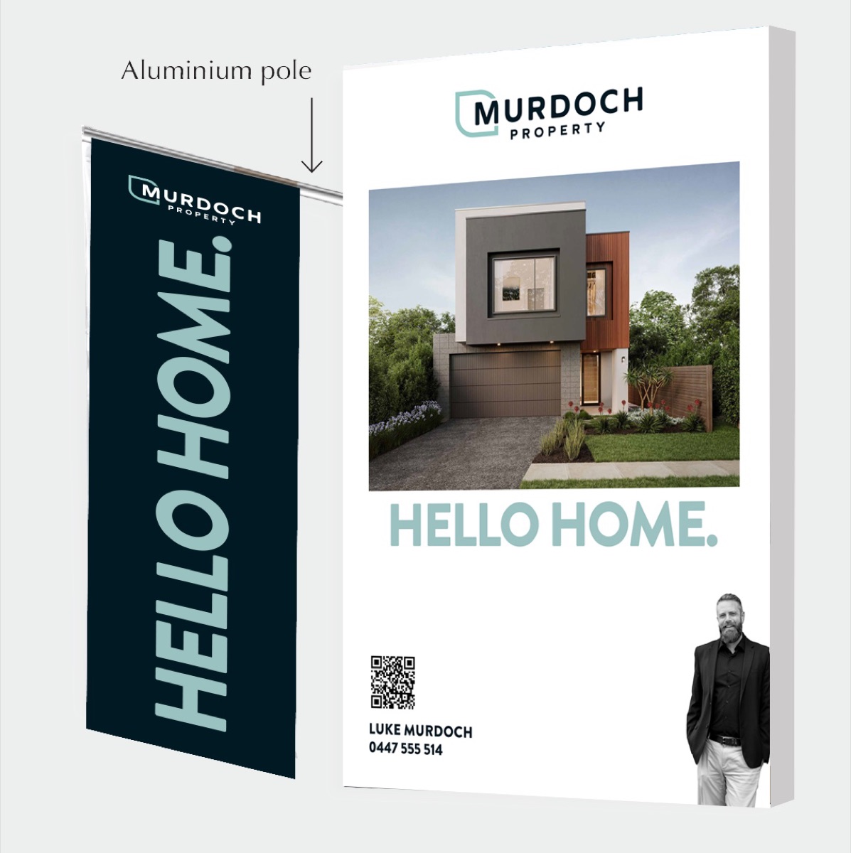
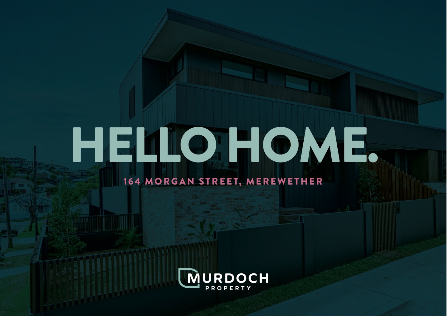
Around the logo we built a simple toolkit: a series of leaf-shaped marks in the brand colours for Search. See. Sold., carrying the idea of growth through the whole brand, and a headline that does the talking, Hello Home. A black and white portrait of Luke gives the brand a friendly, personal face.
Newspaper ad templates mean new listings and auctions can be set up quickly, without the look drifting from ad to ad.
A style guide sheet sets out the fonts and colours, so every sign, flag, ad and flyer looks like it belongs to the same agency.
Our approach
- Understand the agency. How Murdoch Property works, what people already knew about the old logo and what to keep.
- Redesign the logo. A new logo that keeps some elements of the original, with colours and fonts that feel friendly and professional.
- Create the brand toolkit. The leaf-shaped Search. See. Sold. marks, the Hello Home. line and a photo style.
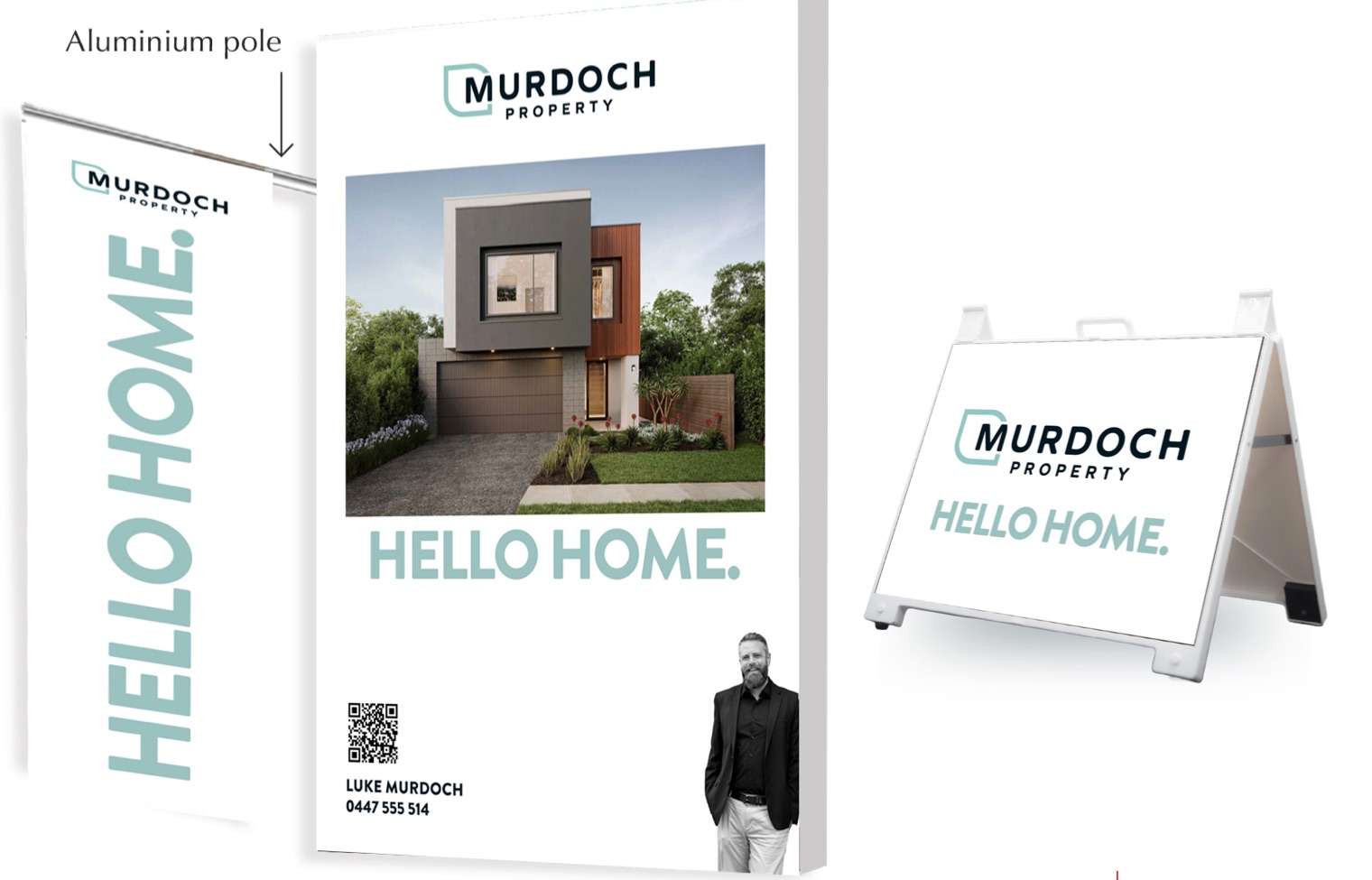
- Put it to work. Signage, flags, open home stands, sold flyers and newspaper ad templates.
How we helped
- Logo design, with versions for light and dark backgrounds, an icon and social media
- Style guide, with brand colours, fonts and the Search. See. Sold. marks
- Stationery
- Signage, including signboards and pointer signs
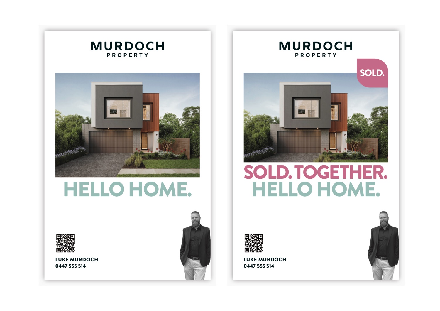
- Sold flyers, with Sold. Together. versions
- Flags
- Open home stands, with A-frame signs
- Sales brochure, with photo pages, listing details and floor plans
- Newspaper advertising templates, with auction and inspection details
The result
Murdoch Property now has a redesigned brand that keeps some of what people already knew and feels friendly and neighbourly. It looks the same from the street to the newspaper to the letterbox: a recognisable logo, a clear colour palette and a campaign line that works across signs, flags, open home stands, ads and flyers. Luke's portrait and a QR code on each piece connect every sign and flyer back to the agent.

Ready to talk about your brand?
Book a free brand consultation and we'll talk through the best next step.
Book a Brand Consultation →