
Corporate brand design gives a business a recognisable visual identity and a consistent way to present itself. It connects the logo, colours, typography and everyday communications so customers can understand who they are dealing with. For businesses considering corporate brand design in Newcastle, the aim should be more than a polished appearance: it should be an identity that reflects the organisation and works wherever customers encounter it.
A strong identity does not replace good service or a compelling offer. It helps make those strengths easier to recognise, explain and remember.
What is corporate brand design, and why does it matter?
Corporate brand design is the visual system a business uses to express its identity across different channels. It includes the logo, colour palette, typography, imagery and layout principles, guided by the organisation’s positioning and personality. Its importance lies in creating a coherent impression rather than leaving each customer interaction to look unrelated.
Think about the journey from a recommendation to an enquiry. Someone might visit your website, read a proposal and then receive a presentation from your team. When those materials share a clear visual language, the business feels like the same organisation throughout that journey.
Inconsistency creates unnecessary friction. An outdated brochure beside a modern website can leave people wondering which version accurately represents the business. Design cannot guarantee trust, but it can remove avoidable doubts about care, clarity and professionalism.
Corporate brand design also gives internal teams a shared starting point. Instead of making subjective decisions about every new document, they can work within an agreed system.
A recognisable identity supports clearer business communication
A business can offer excellent services and still struggle to explain what makes it different. Brand design helps organise that explanation visually, drawing attention to the right information and giving communications a distinctive character.
For example, a consultancy might need a restrained identity that makes complex reports easy to navigate. A growing manufacturer might need product information, recruitment materials and sales presentations to feel connected. Neither needs decoration for its own sake; both need design that supports specific tasks.
The practical benefits include:
- Clearer recognition: Repeated visual elements help customers connect a proposal, social post or sign with the same business.
- More focused communication: Consistent hierarchy helps readers find services, evidence and next steps without searching through clutter.
- Better internal coordination: Shared templates reduce disagreements over fonts, colours and layouts.
- Room to grow: A flexible system can accommodate new services without creating a separate identity for every launch.
These benefits depend on consistent use. A well-designed identity sitting unused in a folder cannot improve customer-facing communication.
The building blocks extend beyond the logo
Corporate logo design is an important part of the identity, but it is not the complete brand. A logo identifies the organisation; the surrounding design system determines how it presents information, creates emphasis and maintains consistency.
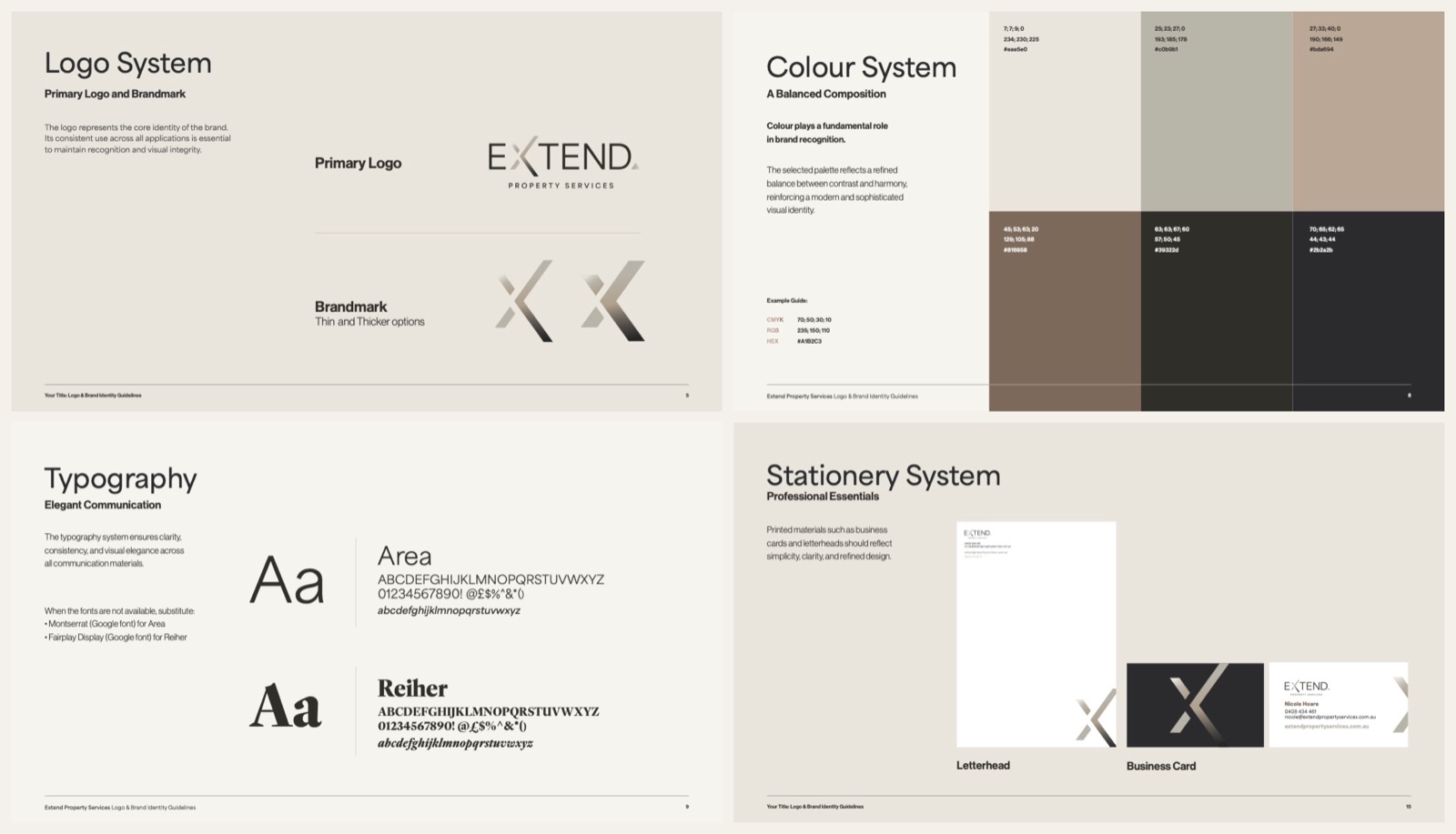
A logo that works in real situations
A useful logo needs to remain clear across the places it will actually appear. That could include a website header, an invoice, a building sign or a small profile image. Reviewing these applications early helps reveal whether the design needs alternative arrangements or simplified versions.
Ask to see the logo in one colour, at small sizes and against light and dark backgrounds. An impressive presentation mock-up is not enough if the everyday files are difficult to use.
A visual language with a clear purpose
Colour, typography, imagery and layout should work together rather than compete. Type choices need to suit both the organisation’s character and the reading task, while colour should create useful distinctions without becoming the only way information is communicated.
Photography and illustration also need direction. Agreeing on subjects, composition and treatment helps prevent a website from feeling disconnected from brochures or campaign materials.
Guidelines that make consistency practical
Corporate identity design becomes more useful when people know how to apply it. Guidelines should explain logo spacing, colour values, type hierarchy and common layouts through clear examples. Templates then turn those principles into practical tools for the documents your team produces most often.
Consistency should allow flexibility
Consistency does not mean making every piece of communication identical. A recruitment campaign has a different purpose from a financial presentation, even when both come from the same organisation. The design system should make that relationship visible without forcing every message into one layout.
Start by separating fixed elements from flexible ones. Logo rules, core colours and typography may stay stable, while photography, page composition and supporting graphics can adapt to the audience or channel.
This distinction is particularly useful when several people create content. A sales team may need quick proposal templates, while a marketing team needs more freedom for campaigns. Both should understand where they can make choices and where consistency matters most.
Keep the system accessible to the people using it. Clearly named files, shared templates and a designated point of contact can make the difference between guidelines being followed and quietly abandoned.
Start with business questions, not visual preferences
Before choosing colours or reviewing concepts, establish what the identity needs to achieve. A Newcastle brand design brief should explain the business, its audiences and the situations in which the design must work. Preferences can inform the conversation, but they should not become the sole basis for decisions.
A useful brief answers these questions:
- Who needs to understand the business? Identify the main customer groups and what they need to know before enquiring or buying.
- What should the business be known for? Describe meaningful strengths rather than broad claims such as being innovative or customer-focused.
- What is currently getting in the way? Gather examples of unclear messaging, inconsistent materials or difficult-to-use assets.
- Where must the identity perform? Prioritise actual applications, including documents, digital channels, signage and any specialist formats.
- Who will approve and maintain it? Agree on decision-makers and responsibilities before the project gathers momentum.
For corporate branding in Newcastle, local context may matter, but geography alone is not a positioning strategy. Explain whom you serve, what those customers value and how your business differs from their alternatives.
How do you choose the right design partner?
Choose a design partner by assessing how they understand your business, explain their decisions and prepare the identity for practical use. A relevant portfolio matters, but so do a clear process, an agreed scope and usable deliverables. The right fit depends on the work you need, not simply whether you like a particular visual style.
When speaking with a Newcastle marketing agency or an independent designer, ask how discovery informs the design work. They should be able to connect visual choices to your audience and objectives rather than relying only on personal taste.
Review portfolio projects as systems, not isolated logos. Look for evidence that the identity works across different materials, and ask which parts of each project the provider delivered.
Before commissioning brand design in Newcastle, clarify:
- Which assets and templates are included, and which would require additional work.
- How feedback, revisions and approvals will be managed.
- What final file formats, usage guidance and handover support you will receive.
- Whether implementation is included or will need separate coordination.
A Newcastle graphic design provider may specialise in identity work, campaign materials or production. Establishing those strengths early helps you choose support that matches the assignment.
Plan the rollout before the launch
A new identity needs an implementation plan, not just a reveal. List the places where customers and staff encounter the business, then prioritise them by visibility, importance and practical effort. This avoids spending the whole budget on development while leaving essential materials unchanged.
Start with high-use touchpoints such as the website, proposals, email signatures and presentation templates. Schedule other updates around realistic production needs rather than replacing everything without a reason.
Give staff a short introduction to the system and show them where approved assets live. Explain what has changed, how to use the templates and whom to contact when an unfamiliar application arises.
After rollout, review whether the identity works as intended. Check real documents and customer journeys, not just the original presentation. Small adjustments to templates or guidance can resolve recurring problems without reopening the entire design project.
Build an identity the business can use
The value of corporate brand design lies in connecting strategy with everyday communication. A distinctive logo matters, but so do readable documents, coherent imagery and templates that people can use confidently.
Whether you are refreshing an established organisation or creating its first consistent identity, begin with clear objectives and real applications. Choose a system your team can maintain, then apply it with care. That is how design becomes a useful business asset rather than a one-off visual exercise.
Not sure where to start? Book a Brand Consultation and we’ll help you work out the right next step.
